How to pick a whole home’s worth of paint colors
White dove walls and Oxford gray cabinets. (Photo courtesy of Christy Kosnic Photography)
Paint color paralysis is real. And the only thing harder than picking the perfect shade is picking a house full of them. Too many jarring hues can leave you feeling like you’re walking through a bag of Skittles. But a monochrome medley can be even worse as you shift from room to room: blah.
When it comes to choosing a palette for your entire home, “the main thing is try to be as cohesive as you possibly can be,” says Sarah Snouffer, founder and principal of Third Street Architecture in Washington, D.C. “Take a little prep time and sit back, think of the whole house, and then you can tackle it room by room as you go.”
Designers have a few words of wisdom for picking a cohesive paint scheme for your home. Here are their top tips, plus three designer-approved whole home palettes that are yours for the painting.
Pick a starting point
It’s wise to start with the room you use the most, says Atlanta-based designer and author Vern Yip.
“For example, a great room that consists of a casual seating area (where the TV is) and a kitchen is often the room that gets used the most in an open space plan home,” he said in an email. “Before nailing down the other colors, make sure to get this one right.”
Snouffer prefers to start with the largest space. “Most homes people live in now are not defined room by room; they bleed into everything,” she says. Begin with that expansive open plan area, and “everything else will follow suit,” she said.
One of Yip’s go-to hues is Sherwin-Williams’ Illusion. “I think this is always a decent starting place because it’s a fairly warm, midtone neutral that plays well with pretty much everything. If it’s not your cup of tea, it’s a great barometer for going warmer, cooler, deeper, lighter, or more vivid.” To go with it, he recommends several coordinating paint colors from Sherwin-Williams:
• Mushroom, a “lighter neutral that still manages to add depth and character to a space.”
• Prospect, “a wonderful, deep brown that adds so much gravitas to nearly every room it’s used in.”
• Taiga, “the intersection of dark gray and dark green that’s a chameleon in the best possible way.”
• Beetroot, for “when you need … or are ready for … a room with a punch.”
Vary light and dark choices
Architect Seth Ballard, founder of Ballard & Mensua Architecture, was introduced to the colorful architecture and interiors of New Orleans when he was a student at Tulane University. “(There was) lots of color, with no fear of personality.”
As a result, he’s always pushed the rainbow envelope a bit and recommends mixing airy and deeper tones for interest. “I’ve always used a little more color in spaces and not been afraid of it,” he says, adding that repeating the same trim color throughout the home can tie rooms together.
And don’t be afraid of darker colors; they can work beautifully in lowlight rooms, Yip says. “In general, I’m not one to combat a dark space with light paint colors. I find that you get better results when you lean into the lack of light by employing richer, deeper hues.”
Consider color undertones
One way to coordinate colors is to ensure their undertones – or underlying hues – go together.
“If you’re doing a lighter color, you really, really need to pay attention to the undertones because if you are looking at a swatch or a sample and it has some type of undertone – let’s just say yellow for this example – that is going to be more prominent once you get more of that color up” on a wall, Snouffer says.
Also look at the paint sample in various types of light to determine whether the undertones work together, she says, adding that she typically paints samples on the wall in at least two-by-two-foot sections.
“Southern light is going to be your direct light that is going to be much more pure, more blue undertone versus northern light where that’s sunlight that is getting bounced off from other things outside of your home and then into your home. … We leave those samples up for a couple of days and watch them as morning light versus afternoon light, a cloudy day versus a sunny day.”
Yip adds that rooms that predominantly receive southern light can benefit from cooler hues, whereas rooms that get cooler northern light may look their best in warmer paint colors.
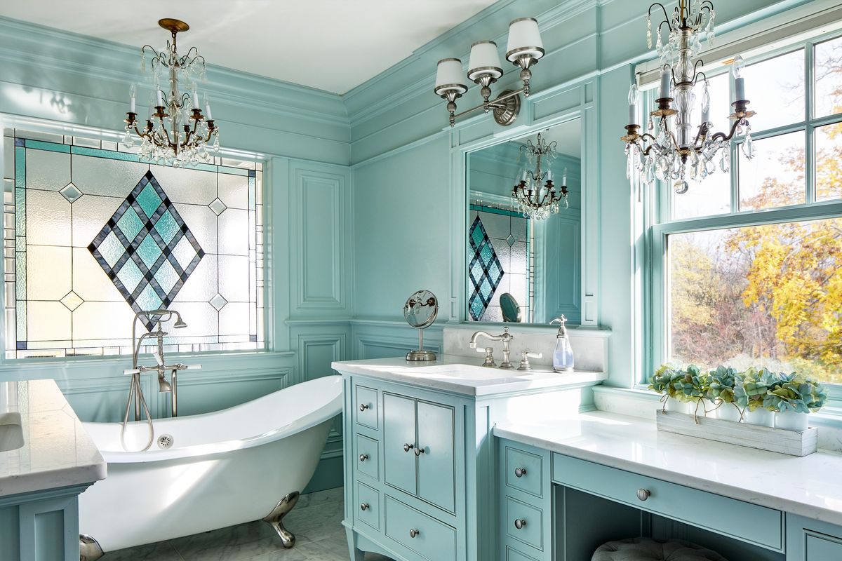
Snouffer likes to use Benjamin Moore’s White Dove in a home’s main space, and build her palette from there. “It’s the one that we just have found that has the most neutral undertone, and so it’s not too pink, it’s not too yellow, it’s not too blue,” she says. “And so it just always seems to kind of work in spaces.” She recently used it in the living room and kitchen of a client’s Washington, D.C., townhouse. She surrounded it with several green shades from Benjamin Moore:
• Deep Cushing Green in the dining room.
• Sage-y Carolina Gull in the primary bedroom.
• Palisades Park, a minty midtone, in the powder room.
Choose history
Another easy way to build a palette is to use the collections created by paint companies. Ballard particularly likes historic hues – or even close matches to yesteryear’s colors (and bonus, the modern versions are lead-free).
“There’s an underlying muted nature to the historic color palette that helps tie them together,” Ballard said. “I’ve always had luck (with them).”
He used several blues from Benjamin Moore’s historic colors collection for a recent project, unifying the spaces with white trim:
• Palladian Blue (historically used as a color on porch ceilings)
• Wythe Blue
• Van Courtland Blue
• Hale Navy
Place your smallest color punches last
Yip suggests picking colors for lesser-used spaces, such as pantries and powder rooms, last. “Rooms that people spend very little time in are the ones to pick at the end and where you can really take chances if you want to,” he said.
And don’t forget to look at all the colors in person
Trying sample pots of your paint choices before you invest in gallons is always a wise move, but it’s not the only thing you need to do. Ballard recommends looking at your color palette at once, well in advance of starting to paint any of the rooms.
“I’ve always found that when you start narrowing down your paint colors, you need to put them all together in a larger sample and actually create a deck of cards,” he said. “And when it’s right, it feels right. And it also might help you kick something off the island because when you see it just doesn’t kind of ‘go.’ ”
Spoken like a true mix master.