From sketchbook to wallpaper: Behind the scenes at Rifle Paper Co.
Rifle Paper Co. products are everywhere. Find party supplies at Target, bedding at Pottery Barn Kids, wallpaper at Anthropologie, and its eponymous stationery collections, well, all over. And they all bear the bright, playful patterns that have become the company’s calling card, each of which began with hand-painted art from Anna Bond, co-founder, CEO and chief creative officer.
While Bond loves painting, her favorite part is what comes next – turning art into a suite of products. “It’s a fun challenge to create things that I think are beautiful but also people actually want to buy,” she says. Bond walked us through how, exactly, that process works, using the Roses pattern, which was released this year, as an example.
Step 1: Sketching and painting
Why roses? “I usually try to do a new floral pattern each season,” Bond says. After the success of the company’s Hydrangeas pattern, she wanted to create another that had a single flower type as a focal point. She drew inspiration from old books filled with specimen paintings and antique prints featuring roses.
Bond sees muses everywhere – a rug in a museum or the pattern mixing in some element of British interior design – and lets the ideas stew in her mind. “My process is usually taking a lot of things in for a while and then cramming a bunch of creativity into a few days – get it all out,” she says. “And then I need to recover and get more inspiration. I’m not like a slow and steady creative person.”
While color is by no means finalized at this stage, Bond gravitated toward a palette of darker reds, yellows and pinks when she started to paint the roses. That color scheme led her toward the inclusion of raspberries.
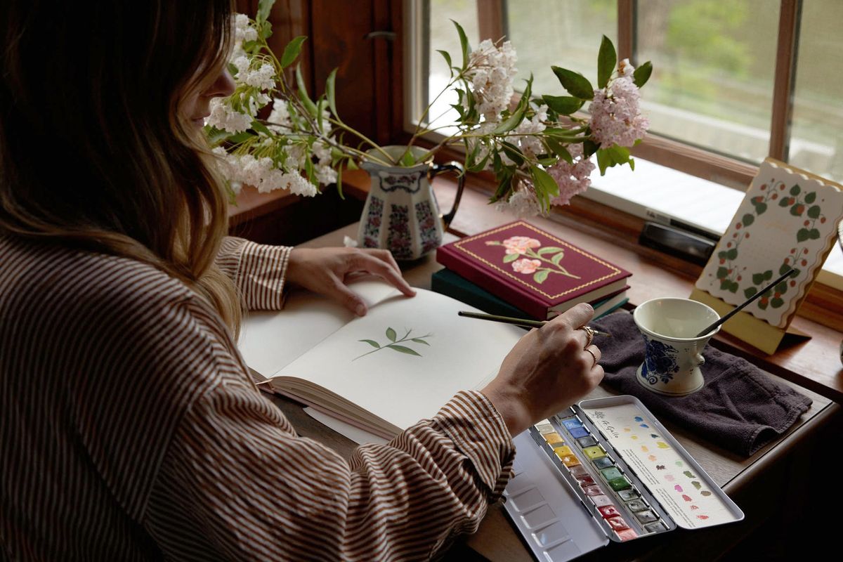
She uses gouache paint on flat watercolor paper each time. Using the same materials and process for her first step brings “a consistency to our brand aesthetic, because everything is really starting with something hand-painted,” she says. But she isn’t concerned about how the elements of the pattern – in this case, the various roses, leaves and raspberries – are interacting at this stage.
“I always say that if someone were to go through all my original paintings, they’re not always that good-looking because they’re just made to scan,” Bond says. That means that she spaces out the components of the painting so she can easily manipulate different pieces. Sometimes, even the paint colors she chooses will differ from what she wants in the final product, because she’s using ones that are easier to work with in Photoshop.
Step 2: Scanning and pattern building
Bond scans all of the paintings into Photoshop at the highest resolution with the help of a large flatbed scanner beneath her desk. The components don’t have to be perfect to be ready for this step. “When we’re piecing things together, I can move a little leaf to hang this way or move the flower head that way,” Bond says. “It’s sometimes funny when I’m painting because I’m like, ‘Oh, I’ll fix that later.’ ”
Once the building blocks for the pattern are loaded into Photoshop, it’s time for Bond and her team to figure out their layout. Should the flowers all be facing in the same direction? How big should they be? How much negative space? Bond usually has a preexisting pattern to compare with the work in progress – often it’s Garden Party, a colorful explosion of blossoms that remains Rifle’s bestseller. “Some of it is putting those next to each other and making sure [the new pattern] does something different,” she says. It also helps in terms of figuring out the scale. Roses “is pretty true to the scale I painted it,” she says.
The Rifle team also has a “library of flowers” – a collection of every blossom Bond has painted that “we can kind of play with and go back to,” she says. The pattern Estee, a checkerboard of plant life, came about through futzing with these archival images.
Step 3: Getting the pattern on paper products
Once there’s a mock-up, Bond will start talking with her team about what kind of items might work best with it. Whenever Bond is introducing a pattern, she likes to do so on products that are already bestsellers. “It’s always risky to put a new pattern on a new product because both are unknowns, right? You could have a real dud on your hands,” she says.
The Rifle team plays around with how to apply the pattern: “Okay, let’s put this on stationery. Maybe it has a mint background. Let’s try these other colors. What’s the font that’s going to go with that on the label?” Bond says. “And we kind of go through that process and start creating actual products with it and then sample those.”
Products employ the pattern differently. Roses on a rug, for instance, will be much larger and more textured than on a spiral notebook. An embroidered journal might have only one of the roses rather than a repeating pattern. A lot of the color choices play to the product itself, and how it will be used, as well as the materials used to make it. Gold might be more of an accent for a notecard, but then a metallic version becomes the background for wrapping paper. “The more we can get out of one pattern, the better,” she says.
Step 4: Turning Roses into wallpaper
Bond has found that colors that work on home products may vary from what works on stationery or accessories. The team is careful with yellows, for instance, which “can be really strong and difficult in-home.” But Rifle definitely doesn’t eschew color for home products like wallpaper. “People want color from us,” Bond says. “So usually when I do something that’s more minimal or quieter, it doesn’t sell for us as well as the things that are brightly colored.”
That’s why, when it came to picking color schemes for the Roses wallpaper, the team wanted to make sure to have one with a bold navy background. Bond has also been drawn to plums and aubergines for home products recently.
Rifle partners with York Wallcoverings on its wallpaper offerings. Figuring out how to use patterns and colors is collaborative. The final decision generally happens at York’s headquarters in Pennsylvania, where all of the options are displayed on boards to examine together.
Consumers get to choose from a handful of colorways for each pattern. “The editing process is really important,” Bond says. “Do we have too many blues overall? Do we have too many kind-of-quirky ones, or which ones do you think are going to sell out?”
Deciding is a bit like drafting a sports team – you want to make that sure all the options work well together and that each brings something unique to the table. She likes to think about it holistically: “Even though the two-color patterns are never typically going to be the bestsellers, they need to be there to tell the story.”