Difference Makers: U.S. Pavilion redesigners create iconic structure in the heart of the city

Sponsored By:

To view all of the 2019 difference makers, click here.
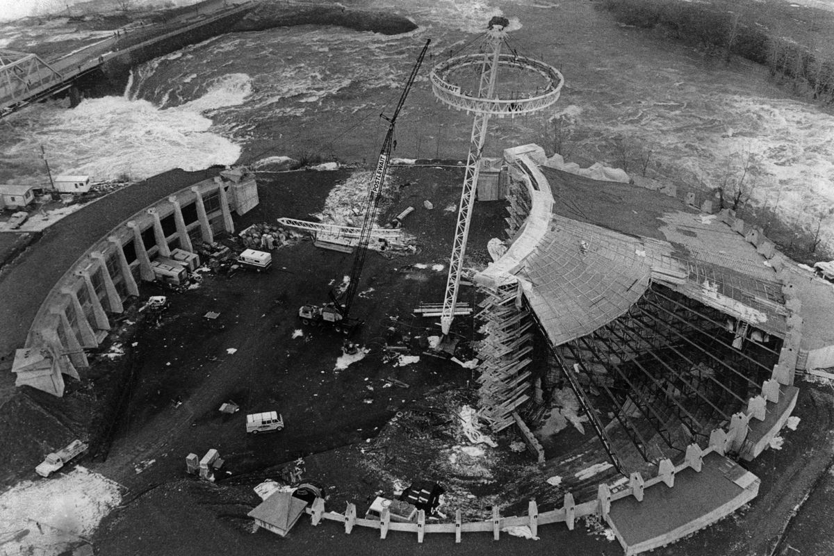
Forty-six years ago – with just 72 days before the World’s Fair officially kicked off in Spokane – Tim Welsh climbed to the top of the incomplete U.S. Pavilion, popped the collar of his thick flannel jacket against the February chill and smiled for the camera.
“All those cables you see, I measured every one of them. I did most of the surveying and layout of the project,” said Welsh, who was project engineer on the U.S. Pavilion for Expo ’74.

It would be five more years before he purchased the company he now runs, Garco Construction, and now, decades later, a new Welsh and a new team of collaborators are standing on top of the Pavilion, so to speak.
Clancy Welsh, president of the family company, headed the team that redesigned and restored the Spokane landmark, a collaboration that included architects, landscape architects and more than one “epiphany,” as NAC Architecture’s Rob Kuffel said.
“There were a couple of epiphanies,” Kuffel said. “Have we added to the legacy? I hope we have.”
As Kuffel acknowledges, it was a team that gave the Spokane icon new life – a life that wasn’t predicted when it was built.
“That structure was only supposed to be there for the World’s Fair and then it was going to be torn down. We built that in 12 months,” said Tim Welsh. “Now we got a lovely new iconic structure for the city of Spokane.”
A phantasmagorical statement
When Expo ’74 opened on May 4, the U.S. Pavilion had competition.
There was the Philippine Pavilion, with Filipinos performing native dances, including “the world-famous bamboo dance,” as the island nation advertised at the time. The West German Pavilion extolled the coal mining and restoration work being done in the Ruhr Valley. In the Korean Pavilion, visitors were greeted by the sound of hundreds of wood chimes and were encouraged to strike a gong when entering. The Canadian Pavilion, to the disappointment of some, was simply an island. Japan, Mexico, China and Iran also had pavilions.
The Soviet Pavilion had a 4,500-pound aluminum relief map of the USSR on its facade. Inside a massive bust of Vladimir Lenin stood sentry, and large dioramas of Russian cities gave the impression of omnipotence. The New York Times described the pavilion as “like Saks Fifth Avenue rigged out for the ultimate in Christmas displays,” but said it was “a phantasmagorical statement of how Russia’s magnitude, might and diversity overshadow such mundane annoyances as dirty water and unbreathable air.”
But the U.S. Pavilion ruled – mainly because its vinyl canopy could be seen from anywhere in the park. Made from 100,000 square feet of fabric and supported by 4.6 miles of steel cables, the pavilion “appears to grow out of the earth,” as the fair described.

During the fair, it was what was below the canopy that got the most attention. The American exhibits included a ringing bell for each birth that happened that day – “more in concern than celebration” because of overpopulation, notes Bill Youngs in his book about Expo, “The Fair and the Falls.” The pavilion featured “Trash Mountain,” a dramatic illustration of the danger pesticides posed to agriculture, and a talking mannequin of Chief Seattle telling visitors that “the earth does not belong to man.”
A year and a half after it opened – and after 5.2 million people visited it – the fair was over. But the story of the pavilion was just beginning.
Its fabric was shredded by wind and done in by heavy snow. Before the end of the 1970s, the fabric was removed, exposing the skeletal framework of the pavilion’s tilted dome. Over the years, the land below gathered more and more attractions. An IMAX theater was joined by an ice skating rink, video arcade and mini-golf course. Carnival rides joined in the fun, and soon a space that was built to increase environmental awareness was devoted to diversion.
A kaleidoscopic life
Rob Kuffel didn’t live in Spokane when the U.S. Pavilion was first built. In fact, he wasn’t even born. Still, he felt a lot of pressure to get it right.
“Everybody had the community in mind and worked to build something for Spokane,” said Kuffel, a lead architect on the project who works at NAC Architecture. “We took that to heart, honoring its legacy.”
Part of that was to shift attention – upwards.
“The whole canopy, and whether we cover it or don’t, was front and center on everybody’s mind,” Kuffel said.
In May 2017, the city and Spokane Park Board picked the team to design and renovate the U.S. Pavilion, which consisted of Garco, NAC and Berger Partnership, a landscape architecture company.
Right away, Kuffel said, they knew the cables alone weren’t enough to define the pavilion.

“You don’t really see them,” he said. “They don’t really define the iconic shape. And the canopy did. How can we define the shape of the canopy, without the canopy, but give it some opacity?”
So Kuffel and some colleagues began brainstorming ways to illuminate the cables. They thought about stringing LED lights on the cables like Christmas lights, but felt it was too predictable. They discussed washing the cables with light from below, but realized the cables weren’t big enough to catch the light.
In June 2017, Ryan Palmquist, another architect at NAC, suggested putting some sort of metal blade on the cables, to catch the light shone from below. Palmquist “had it all on his computer,” Kuffel said. “He had me come over to his desk. ‘What do you think of this?’”
That sparked Kuffel’s first epiphany. Years before, he had purchased some LED running lights to install on his car, but never got around to it. Spurred by Palmquist’s rendering, one night in his garage Kuffel put the lights on the edge of a Plexiglas panel and turned it on. It took all of ten minutes.
“I taped it up, lit it up,” he said. “It was gorgeous.”
He gave his prototype to NAC’s engineering department to create a truer mockup, which then went to Power City Electric to build the next prototype. A few iterations and many meetings later, the light blades were approved for the canopy.
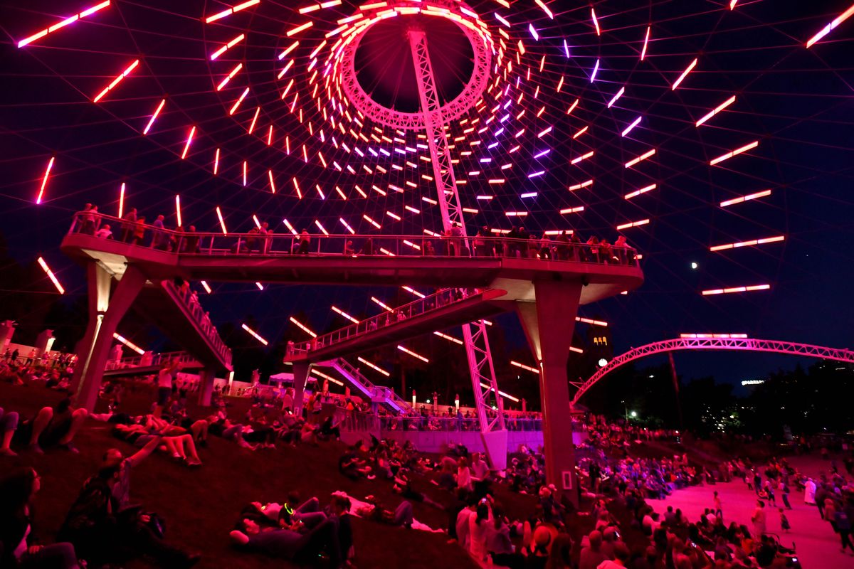
Over the course of last winter, crews from Power City installed the blades – 479 of them, varying in length from three to six feet. Each blade is capable of glowing red, green, blue, white or a combination of those. The sum of a simple idea and simple engineering had combined to make something greater: a new, kaleidoscopic life for the old Pavilion.
“It was such a simple idea. That’s the beauty of this project,” Kuffel said. “It’s elegant and simple. We saw that beauty in this building through all the noise of its additions and the IMAX and everything that was put it in here. We decided to clear out that noise.”
A landscape of absurdity
Simplicity and elegance were fine for the structure, but Guy Michaelsen had a different word he wanted to take hold at the Pavilion: absurdity.
Michaelsen, a landscape architect and principal at Berger Partnership, isn’t referring to the menagerie that slowly populated the old Pavilion space, which he criticized, but to his vision for the final product.
“People had made really good, well-intentioned decisions over 40 years,” he said of the varied activities of yore at the pavilion. “But at the end you were left with a bunch of decisions that didn’t really fit together.”
Michaelsen described an inverse relationship with the Pavilion. The farther you were from it, the more impressive it was. “But as you got closer, it got less and less cool. And when you got there, it was downright underwhelming,” he said.
Michaelsen wanted to flip the equation on its head.
“You need to see this thing from afar and be amazed, but as you get each step closer, it needs to get more impressive,” he said. “That became the driver. We stripped everything away. The pavilion is just more of the park. It is an amazing part of the park, but it’s a terrarium. We wanted to create a landscape of absurdity. We’re under this absurd structure. It’s an absurd landscape within this cool, contained vessel.”
Michaelsen and Berger are responsible for all the new landscaping features in Riverfront Park. If you’ve walked around, you know what he’s talking about. Small patches of inclined lawns along the Howard Street promenade. Basalt pillars jutting out of the ground. Geometric shapes that suggest a pattern, if only you could fly and see from above. It’s nice, but odd.
“The idea of those forms, they relate to what’s going inside the pavilion,” Michaelsen said, describing two hands coming together with fingers intertwined. The park and the pavilion, he suggested, are one, connected by the landscape.
But more than that, the absurd landscape in the pavilion is a “hyper unnatural version of a natural landscape” that’s as good empty as it is filled with people. Above all else, however, the pavilion has been connected to the river and back to the city in a way it wasn’t before.
“You couldn’t see the river. You couldn’t hear the river. You couldn’t see the city. You couldn’t hear the city,” he said. “Now it’s unmistakably tied to the river, and the city.”

Michaelsen was mainly referring to what’s called the “elevated experience” – a catwalk in the pavilion that serves no purpose other than to offer a great view.
“There was no problem to be solved by that,” Michaelsen said. “But here’s the deal. It’s absurd things we remember. It’s absurd things we love. It only will get better with age, too. People are going to figure out new ways to use it.”
Tim Welsh, with Garco, agrees. The “menagerie” below the pavilion has been replaced and improved. As for people finding new ways to use it, Welsh said there’s plenty of time.
“There’s been very little degradation of the cable structure,” he said, predicting the nearly five-decade-old U.S. Pavilion is nowhere near middle age, let alone its demise. “Forty-five more years? That sucker will make it 100 more.”