WSU grad student designs map of precinct-level election results
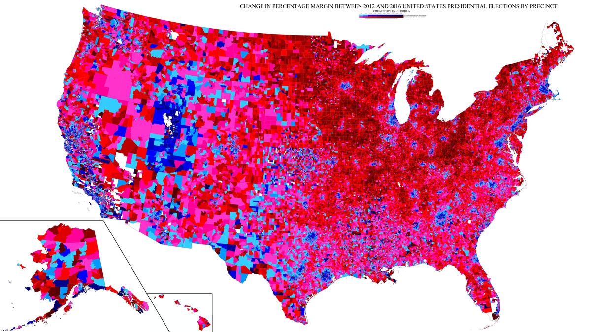
This map shows the shift in voters from the 2012 to 2016 U.S. presidential election. In red areas, more voters flipped from Barack Obama in 2012 to Donald Trump in 2016. In blue areas, voters flipped from Mitt Romney to Hillary Clinton. (Ryne Rohla / Courtesy)
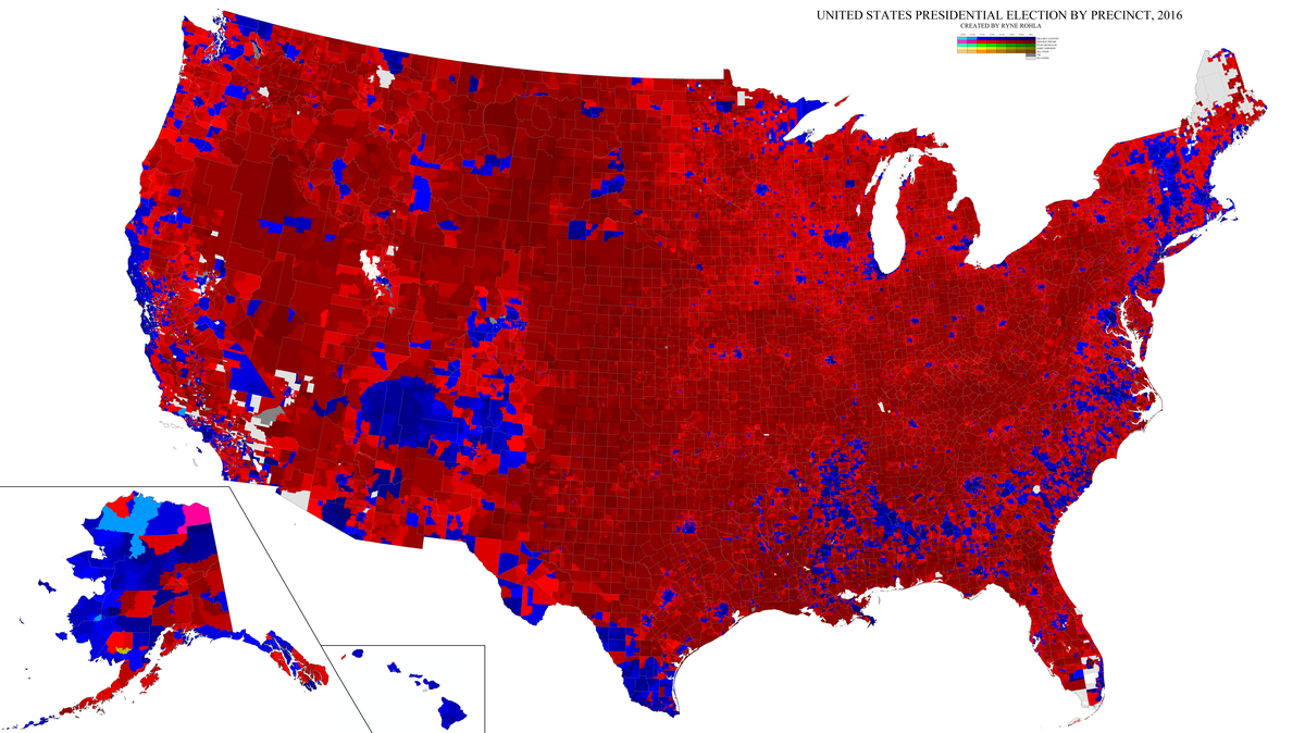
A Washington State University graduate student has created what he believes is the first map showing precinct-level results for the 2016 U.S. presidential election.
Ryne Rohla, a doctoral candidate in economics, created the map as a side project. He’s now planning to incorporate the results into part of his dissertation, where he’ll look at how changes in insurance coverage due to the Affordable Care Act correlate with voting patterns.
“I think that a lot of good research can come out of it,” Rohla said.
The map, which shows a sea of red across much of the Midwest and Rust Belt with blue pockets in cities and along both coasts, provides a much more detailed look at how people voted in different communities than the state-, county- or ZIP code-level data that’s often used to map elections.
Some data points are just interesting, like the handful of precincts where a plurality of people voted for Gary Johnson, Jill Stein or Evan McMullin. Rohla said the Johnson and Stein precincts are mostly rural and usually have just a handful of voters, often fewer than 10.
McMullin won several large precincts, a small green cluster around college towns in Utah. Johnson won a small precinct in Benton County, Washington, receiving two of the residents’ three votes (the third was for Donald Trump).
Rohla’s favorite oddity was another three-person precinct near San Bernardino, California, where Johnson also won. The area is home to the Integratron, an attraction described as a “resonant tabernacle and energy machine sited on a powerful geomagnetic vortex in the magical Mojave Desert” where visitors can receive healing “sound baths.”
It “kind of seems like a precinct where a libertarian would win,” Rohla joked.
But the data can also answer more serious questions. Rohla has also mapped 2008 and 2012 election results, as well as the change in votes between 2012 and 2016. In states that expanded Medicaid under the ACA, “a larger increase in the people being covered generally correlated with a larger increase to Hillary Clinton,” he said.
But higher-income precincts where people added insurance through the ACA marketplace didn’t show the same increase, he said. His theory is that those precincts were more likely places where people chose to forgo insurance coverage, rather than places where people wanted coverage but couldn’t afford it.
For both 2012 and 2016, race was the biggest predictive factor in how a precinct voted, Rohla said. But the correlation between a precinct’s racial makeup and voting behavior decreased slightly in 2016, he said, while the influence of education levels and rural versus urban precincts was more pronounced.
On the whole, precincts that were majority black swung slightly toward Trump in 2016, though Rohla cautions against reading too much into that, since it could easily be the effect of lower turnout.
Overall, two types of precincts had big vote swings from 2012 to 2016, he said. Predominantly white communities in the Midwest and Rust Belt were likely to swing more toward Trump after voting for Barack Obama in 2012, Rohla said.
“The map really demonstrates how poorly Hillary Clinton did in the Rust Belt and the Midwest,” he said.
Though less of a force, a number of highly educated suburban and largely white communities had the largest swings toward Clinton. In some cases, those precincts were blue before but went for Clinton in much higher margins. In others, Rohla suspects they were home to more moderate Republicans who were reluctant to vote for Trump.
Because it shows such localized data, Rohla’s map gives a much better picture of political polarization in the U.S. A single precinct of blue in a sea of red isn’t uncommon, nor is the reverse. Spokane is largely blue, other than a number of precincts in the northeast.
Spokane Valley and Liberty Lake are mostly red, as is Kootenai County, though one precinct covering much of Coeur d’Alene and two near Sandpoint stand out as the only blue in the Panhandle.
“There’s a lot more diversity of opinion within counties than you’d expect to see looking at the county-level map,” Rohla said.
But in some places, the individual data shows more polarization than you’d notice on a larger scale. Those are precincts where 80 or 90 percent of voters went for one candidate. More of those showed up in 2016 than in 2012, he said.
Rohla has already received several requests from researchers at other universities, including UCLA and Stanford, who want to analyze policy and social issues using his data.
After graduating, he hopes to get a job in the private sector where he can continue looking at the intersection of geography and economics.

