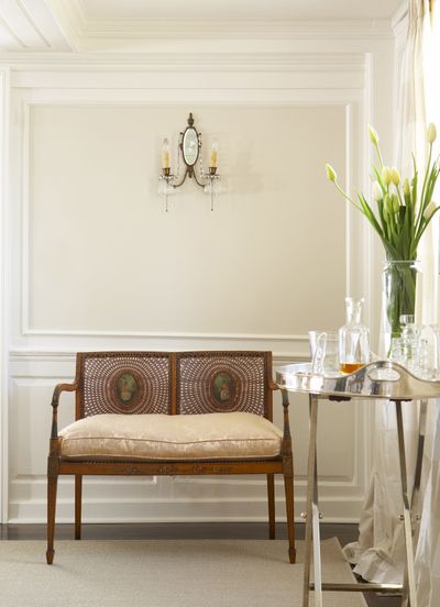
Subtle variations make difference with white

NEW YORK – So you want to paint a room white. Sounds easy, until you go to the hardware store to buy paint and discover there are dozens of whites to choose from.
Many have familiar yet poetic names that conjure up ever-so-slightly different hues: cream, pearl, vanilla, snow, chalk, ivory, jasmine, bone. But the closer you look, the more confusing the choices are. You want a plain, basic white, but the purest white on the color chart looks a little harsh next to all those soft shades with just a hint of something else – beige, gray, peach, rose, yellow or the palest-ever blue or green.
Often people default to white because they don’t want strong colors in their home. But as it turns out, “it’s harder to choose white than any other color,” said Sharon Grech, a color design expert at Benjamin Moore Paints.
She says Benjamin Moore alone offers more than 150 whites, and “when people are choosing white, I see more people unhappy or making a mistake or being shocked at the color than when they choose other colors.”
And watch out if you go with a pure white untinted by any other hue. Leatrice Eiseman, executive director of the Pantone Color Institute, which maintains color standards, says “the purity and cleanliness” of the purest whites “can also make them feel very sterile and cold. And you can literally get eyestrain from too much dazzling white. So you’ve got to be cautious. Most people don’t want to live with hospital white.”
More so than with other colors, whites are also more influenced by colors around them, so Grech says it’s crucial to try a sample to see how it looks in the room. Buy a pint and paint a 2-by-2-foot board that you can move around your home. “Sometimes the sun hits it one way or another at different times of day, or it looks different against the rug, or you realize it’s got a lot of pink in it or green in it,” she said. “It might look totally different in the morning than at night.”
The paint sheen makes a difference too, whether matte – a flat paint – or a shiny high-gloss. One recommended mix is a semi-gloss trim with matte on the walls.
And don’t forget the ceiling. “More people are thinking of the ceiling as a fifth wall,” Grech said. “Think about it in terms of all the rooms that white is going to be flowing through on the ceiling.”
Most people want flat paint on the ceiling, but if you want to bring focus to the ceiling, a semi-gloss or high gloss can look “spectacular” in the right space, she said.
James Martin is an architectural color consultant whose company, the Color People, designs colors for buildings. He says “if you’re going to have white, you want to use a warm white – yellow white, peachy white, rosy white. Anything you live with, you want it to be warm.” It’s especially important in an old house: “If you use a warm white, you’ll see all the wonderful details in the surrounding woodwork much better,” he said.
He adds that “white kills art. When you put a piece of art against a white wall, it isolates the painting so it becomes like a postage stamp – a thing in a box. If you put the same painting against a colored wall, it eliminates those boundaries, pulls the colors out of the painting and brings the painting to life.”
Martin doesn’t like white walls, though he’ll use off-white in a ceiling. He cautions that bright white trim and a bright white ceiling will make other colors look brighter than they would if you were using an off-white. What can work, he says, “if you really like white,” is to choose a warm white for walls in a flat sheen, then high-gloss trim the same color. “It’s a very sexy, subtle thing to do,” he said.
Don’t pick colors online, advises Martin, because they can be distorted. But there is an art to studying the paper fan deck of paint colors in the store. Bring a white piece of paper with a square cut out so you can focus on the color you’re considering without being influenced by the hues around it.
And if you’re color-challenged and unsure whether the white you’re eyeing is more on the rosy side or the orange side, follow it in the fan deck from its palest iteration to its deepest, to see its true undertone. Warm tints include red, orange, yellow and offshoots like peach and apricot, but if you want to cool a room off, go for colors like blue and purple. In between are the neutrals – taupe, gray, beige.
And don’t get overwrought about the choices. “I think most people have more judgment than they think they do,” Eiseman said. “You look at something, you have a doubt about it because your eye is telling you something is off here. Or you look at it and it pleases you. In the end, it’s your eye and your comfort level.”