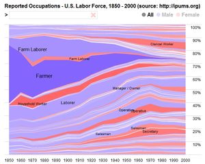
The Story of the Industrialization of Food In One Handy Chart
This chart is fascinating in so many different ways. It takes the reported occupations of the U.S. labor force between 1850 and the year 2000, and brings the data to life through this image. I love the image because it clearly shows the dramatic changes in the way food is produced. We've gone from over 50% of the U.S. workforce involved as farmers or farm laborers in 1850 to just a little over 1% in the year 2000. Go here for the full-sized interactive chart.

