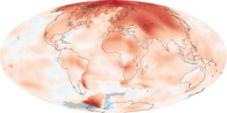
Global warming mapped
 New reports from NASA prove, once again, the world is getting warmer. They conclude "whether the cause is human activity or natural variability, thermometer readings all around the world have risen steadily since the beginning of the Industrial Revolution." It's hard to not make the case humans haven't had an impact given the temperature rise since coal was mass produced, correct?
Above is one of several cool maps, showing temperature anomalies for 2000-2009. (You can view a larger version, plus the full story HERE.) The maps do not depict absolute temperature, but "how much warmer or colder a region is compared to the norm for that same region from 1951-1980."
According to NASA, that period was chosen largely because the U.S. National Weather Service uses a three-decade period to define “normal” or average temperature:
The GISS temperature analysis effort began around 1980, so the most recent 30 years were 1951-1980. It is also a period when many of today’s adults grew up, so it is a common reference that many people can remember.
To conduct its analysis, GISS uses publicly available data from 6,300 meteorological stations around the world; ship-based and satellite observations of sea surface temperature; and Antarctic research station measurements. These three data sets are loaded into a computer analysis program—available for public download from the GISS Web Site—that calculates trends in temperature anomalies relative to the average temperature for the same month during 1951-1980.
The objective, according to GISS scientists, is to provide an estimate of temperature change that can be compared with predictions of global climate change in response to atmospheric carbon dioxide, aerosols, and changes in solar activity.
Read more in World Of Change: Global Temperatures.
